Project Overview
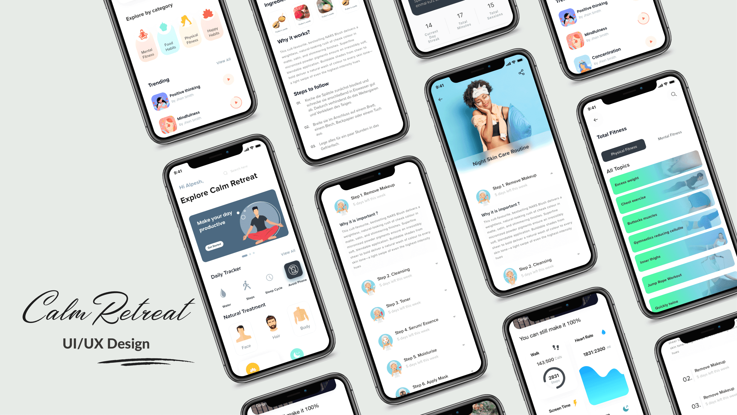
"Bbeautiful" is a brand that values nature and natural beauty. Each method includes organic, and biological treatment of our body, which builds the brand as one that is socially and morally aware (about environmental concerns), the design of the application is kept clean, minimal and elegant with a modern touch to it. It also contributes towards building a world where beauty is more inclusive, transparent and wdholesome.
Principles of HCD are employed to ensure users' engagement at every phase of the process. Double Diamond design model was implemented. It has four stages: Discovery, Definition, Development and Delivery.
1. Discover
Problem Statement | UX Competitive Analysis | Content Audit | User reviews and feedbacks
2. User research
Surveys & Interviews | Empathy Mapping | User Persona | Mental Models | User Flow & Task Analysis
3. Ideate
Idea board| Sitemap | Low-fidelity Prototype | High-fidelity Prototype | Usability Heuristic Evaluation
4. Usability testing
Test Plan | Test Script | Recommendation for future design efforts | Preference Test
5. Visual design
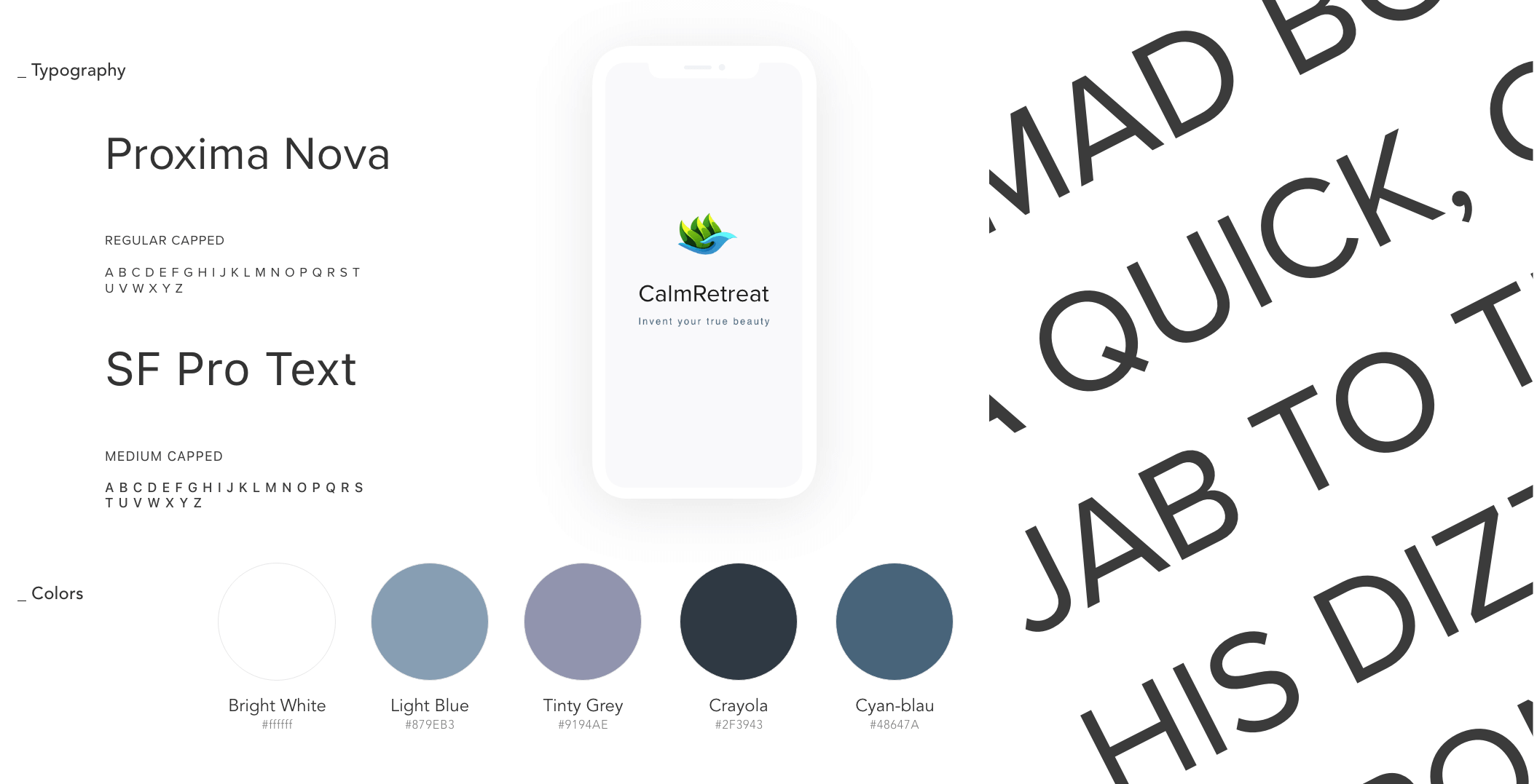
Evaluating the Design for Visual Design Principles | Evaluating the Design for Accessibility | Style Guide
Understanding the Problem
The retention rate (The Monthly Active Users (MAU) KPI metric)of my application in the last 90 days is half of the user loss. Something is wrong here, apart from the technical aspects. As a quantitative value, MAU only shows the number of visitors, but no component considers the depth or quality of the user experience. We identify the pitfalls of this situation and design something meaningful to users in the long run. Customer reviews and feedback were also taken into account to find further ideas for improvement. Strategies for expansion into a new market: search for market gaps to be addressed
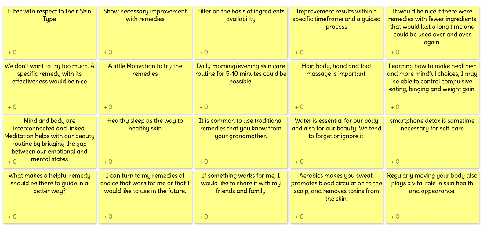
Idea Box
The first step in understanding my user base was to define research objectives through cognitive walkthrough of the existing app, which could then be evaluated through interviews and surveys with potential bbeautiful users. Analysis of the interviews and fetching empathy mapping helped to refine my potential users' behaviours and attitudes, needs and goals, frustrations, pains, and insights.
Next, with a wealth of information from my interviewees, I created unique user personas to begin designing for. Then, with their goals and expectations in mind, I began creating user flows to give the project a visual guideline.
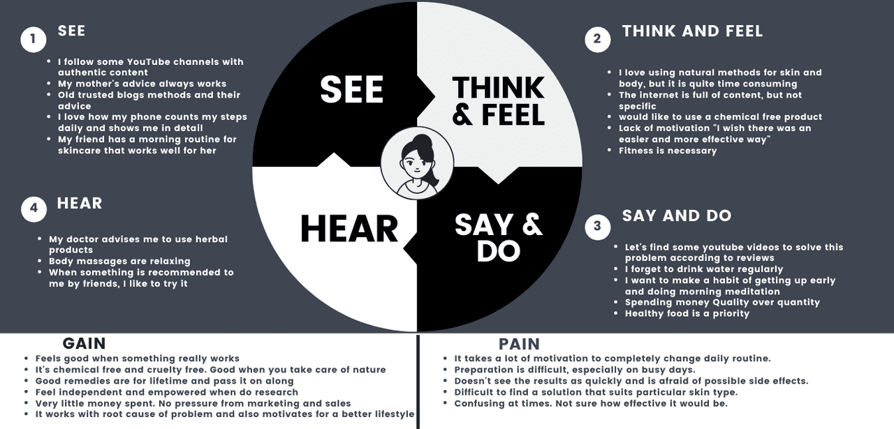
Empathy Mapping
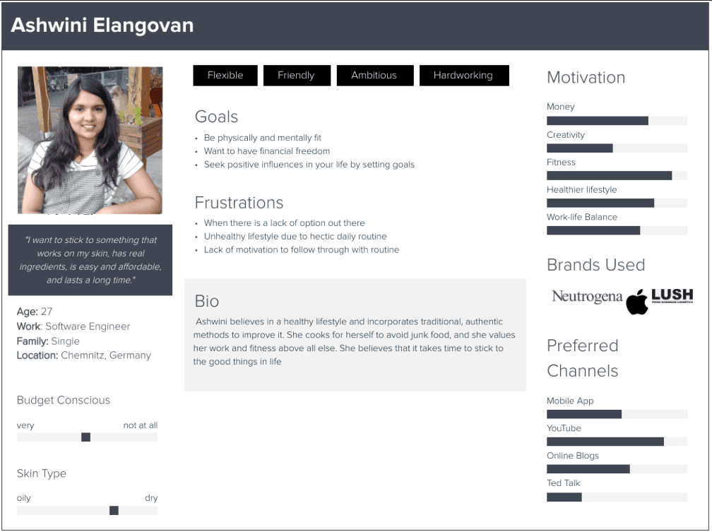
Persona
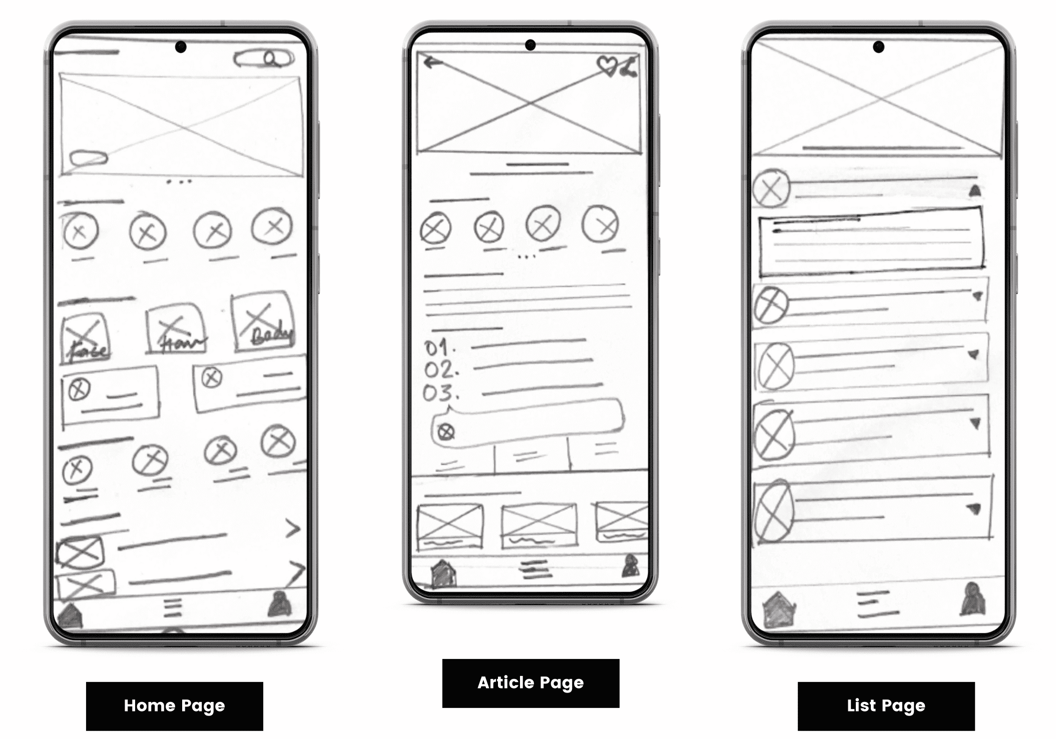
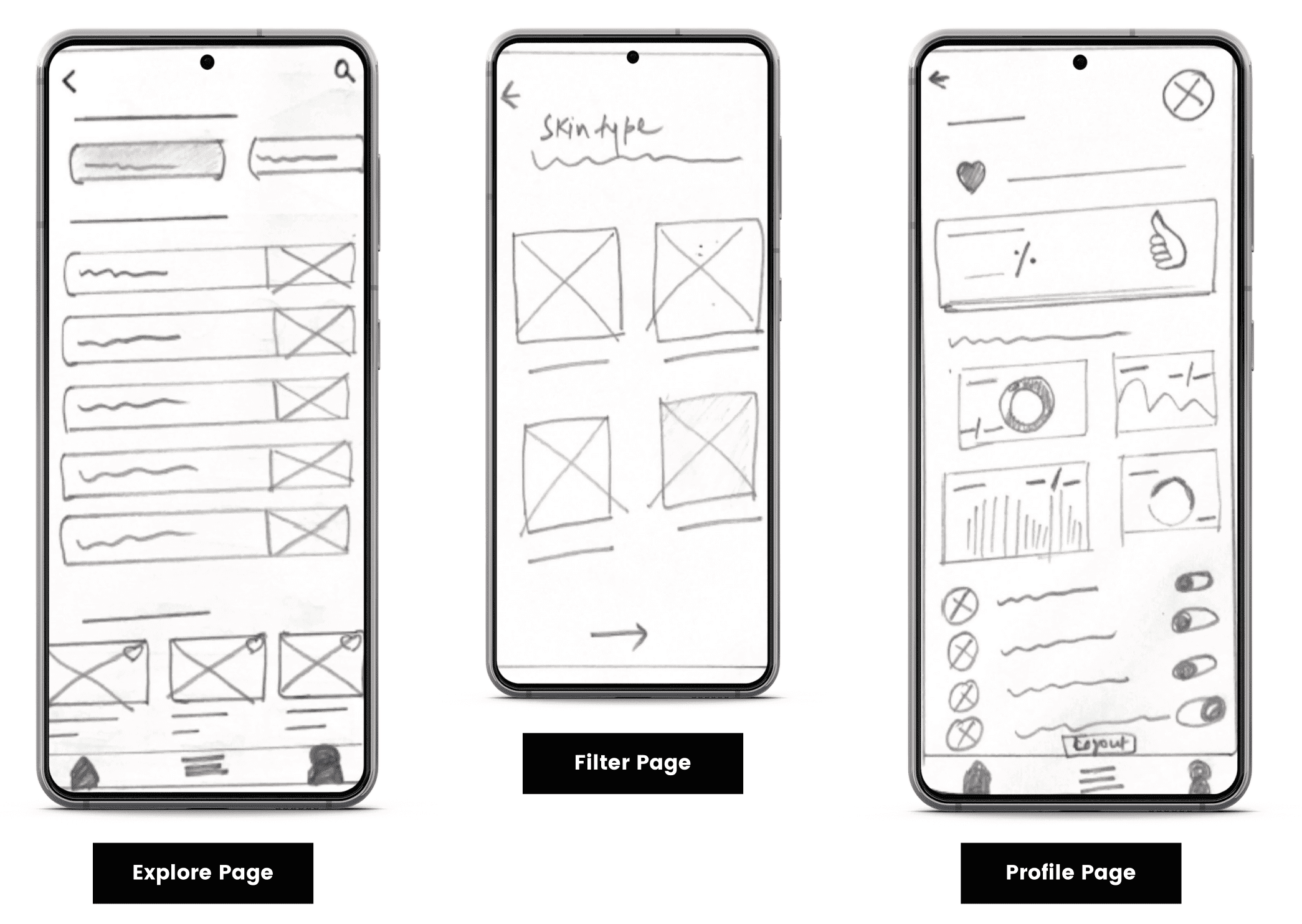
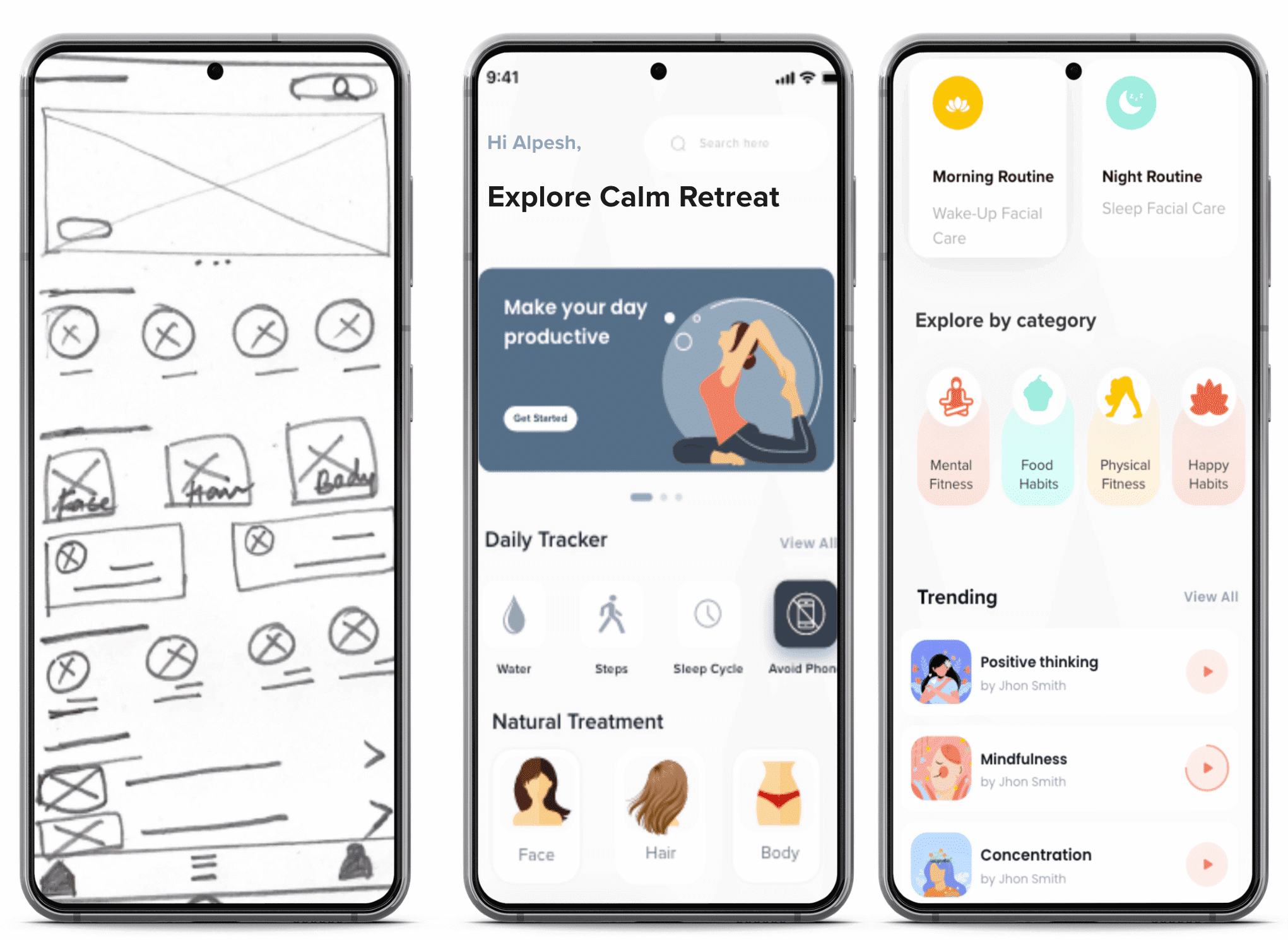
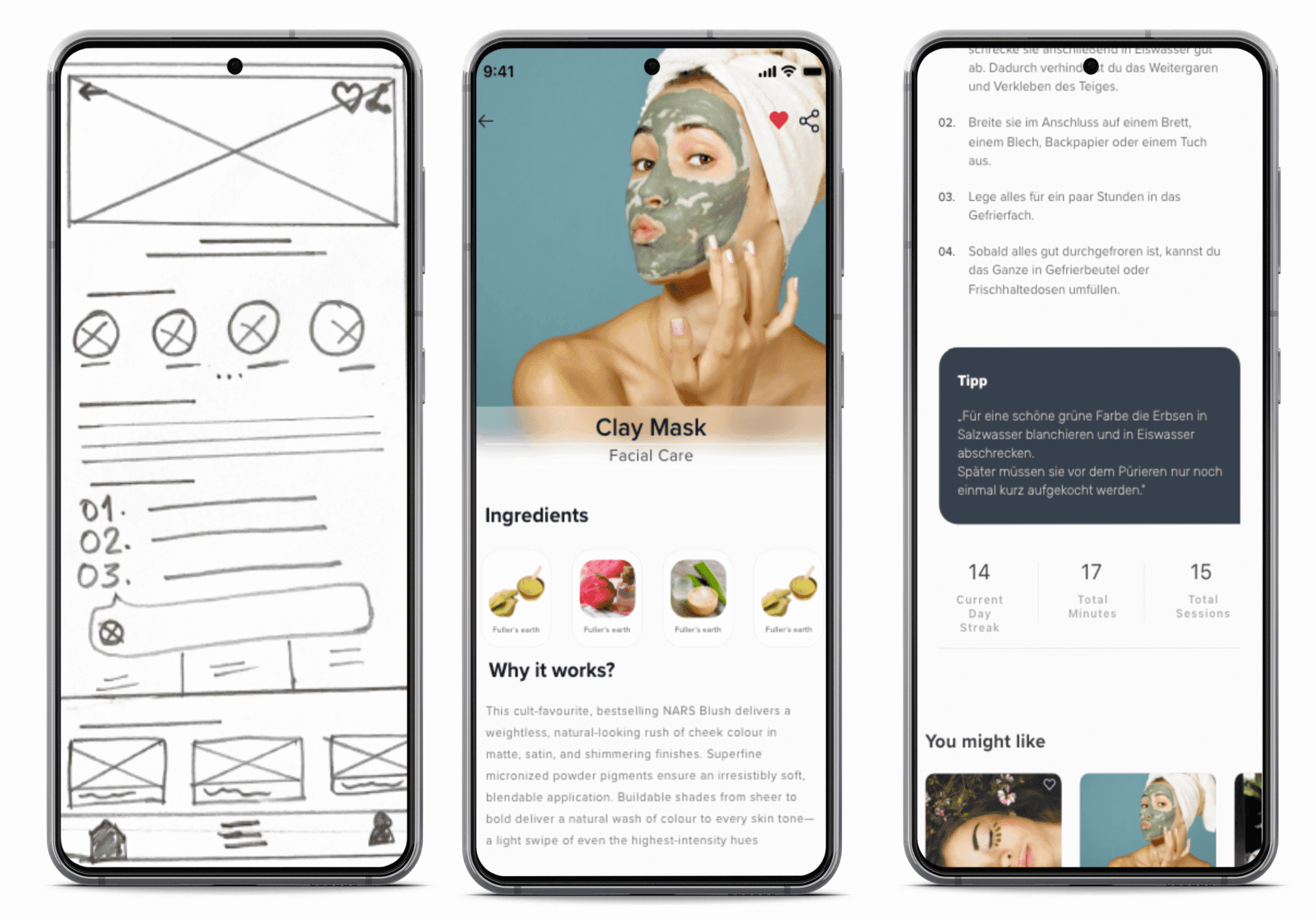
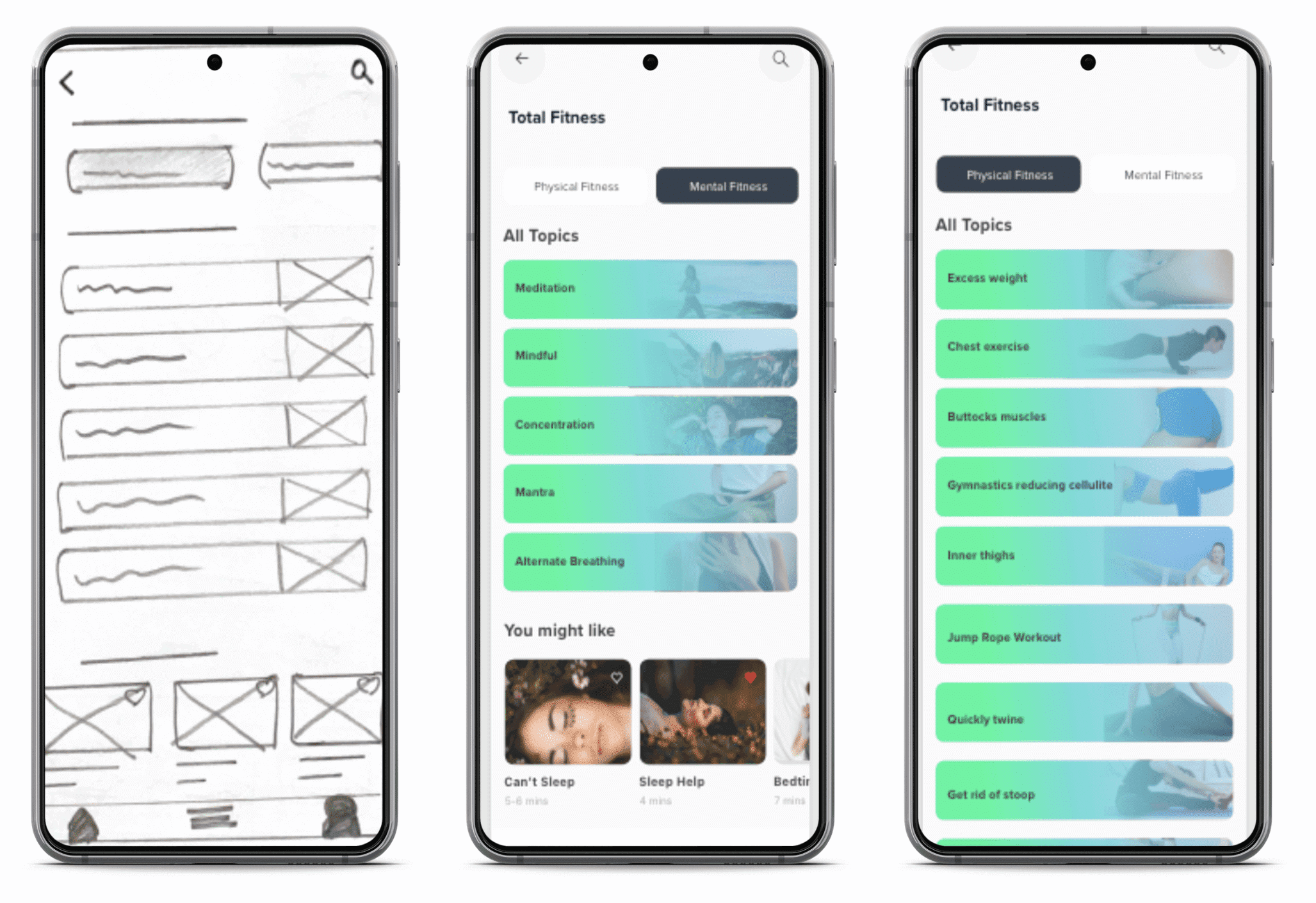
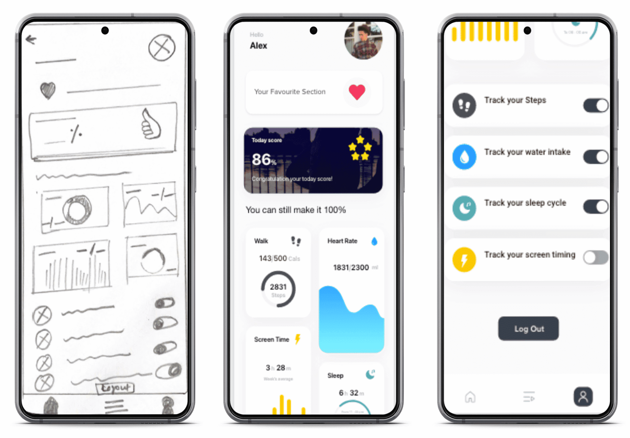
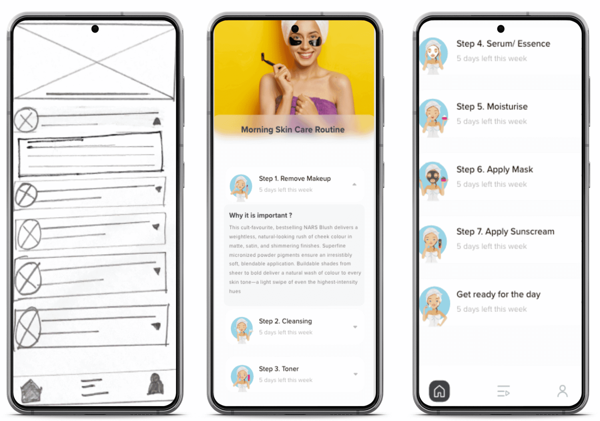
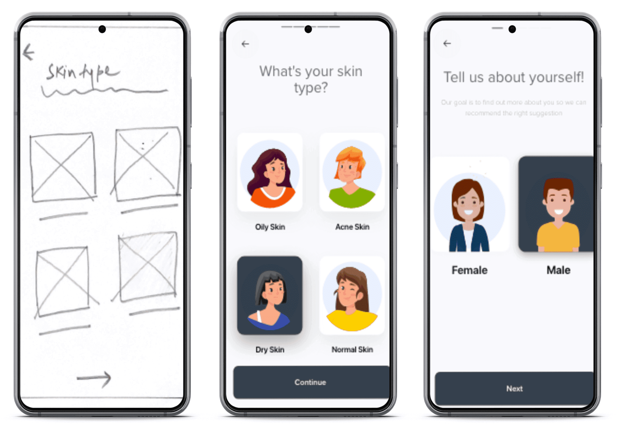
Before I began sketching wireframes, I conducted an open card sort to determine the information architecture of bbeautiful app. The data from the card sort helped identify potential improvements to the current design concept, and highlighted some navigation paths that were imperative. With these findings, a site map was created. I started with low-fidelity ink-on-paper wireframes and a mobile-first design approach, and began iterating to a higher-fidelity prototype. At each stage, I conducted usability testing ( Moderated (tasks analysis) + unmoderated (SUS))to validate design decisions or identify problem areas.
